
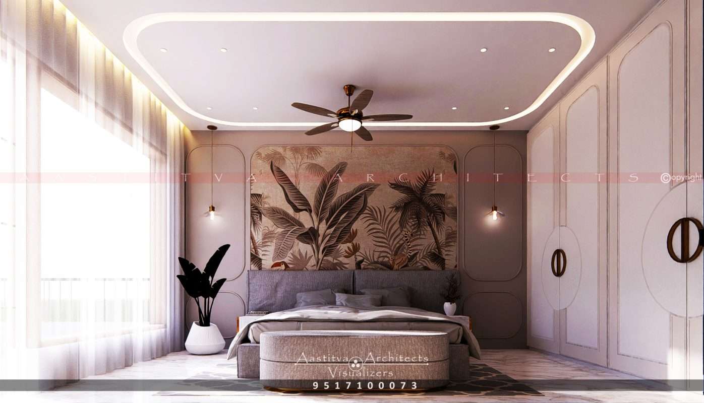
A Project done by Aastitva Architects, book your appointment now +91 9517100073
Selecting the perfect color for your home is more than just picking a shade from a catalog. Even the most beautiful interior design ideas can fail if the color palette doesn’t harmonize with the architecture and lighting. In 2026, as minimalist interior design and white interior design ideas trend, avoiding basic color errors is essential to maintaining the aesthetic integrity of your residential architecture.
1. Ignoring the Impact of Lighting
The most common mistake is choosing a color based on a small swatch under showroom lights. Real-world lighting—both natural and artificial—changes how colors appear throughout the day. I am drawing on my general expert knowledge here: colors can look significantly different at noon compared to sunset. By utilizing lighting techniques in architectural visualization, we can simulate these changes digitally, ensuring your chosen material palette looks perfect in every light.
2. Overlooking the “Fifth Wall” and Flooring
Color does not exist in a vacuum. A common error is selecting wall colors without considering the floor and the ceiling. I am drawing on my general expert knowledge here: the floor is a massive reflective surface that bounces its own tint onto the walls. Professional interior visualization services help you see the relationship between your ceiling design ideas, wall colors, and flooring in a single cohesive view, preventing clashing tones.
3. Neglecting Material Honesty
In 2026, material honesty is a core design principle. A mistake often made is trying to “paint over” the natural beauty of materials. For instance, instead of using a flat brown paint, using a Golden Brown Leather accent or natural wood veneer provides a warm, welcoming tone that paint cannot replicate. A successful material palette should celebrate the authentic textures of the stone, wood, and metal used in your contemporary house design.
4. Choosing Colors Without 3D Verification
Trying to imagine how a bold color will look across an entire room is risky. This often leads to “color regret,” where the final result feels overwhelming. Photorealistic architectural rendering eliminates this guesswork. Through 3D architectural rendering, you can virtually apply various color schemes to your luxury living room design before committing to a single drop of paint.
5. Playing it “Too Safe” or “Too Bold”
I am drawing on my general expert knowledge here: homeowners often swing between choosing only neutrals (which can feel bland) or too many high-contrast colors (which can feel chaotic). Achieving volumetric balance means knowing where to use a “statement” color and where to let the architecture speak for itself.
Why Choose Aastitva Architects?
At Aastitva Architects, we use world-class interior visualization services to help you finalize your home’s color story. We prioritize material honesty and architectural integrity, ensuring your interior design ideas are executed with precision. Our 3D rendering process allows you to experiment with different palettes in a risk-free digital environment, ensuring the final result is exactly as you envisioned.
Conclusion: Color Your Home with Confidence
Avoid the frustration of costly repaints by planning your colors digitally. By considering lighting, respecting material honesty, and using architectural visualization, you can create a home that is vibrantly alive and perfectly balanced.