
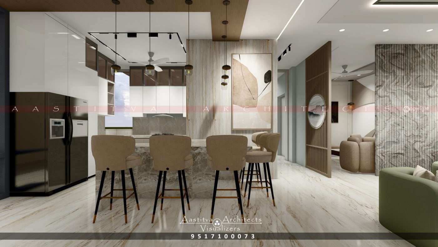
A Project done by Aastitva Architects, book your appointment now +91 9517100073
In 2026, interior design ideas have moved beyond just following the latest fashion; they are now deeply rooted in the science of psychology. The colours you choose for your home do more than just fill a space; they dictate the emotional energy of your residential architecture. Whether you are designing a luxury living room or a minimalist bedroom, understanding colour psychology is essential for creating a sanctuary that truly works for your family.
1. The Emotional Impact of Your Material Palette
Every colour in your material palette triggers a specific psychological response.
- Cool Tones for Serenity: Blues and greens are staples for modern bedroom design, as they lower heart rates and promote rest.
- Warm Tones for Social Energy: For luxury living room design, we often use welcoming, warm tones that encourage conversation and hospitality. These tones make large spaces feel more intimate, helping to achieve a perfect volumetric balance.
2. Material Honesty: The Soul of Your Colour Scheme
In 2026, the trend is toward material honesty—using colours that are inherent to the materials themselves.
- Authentic Textures: Instead of painting over everything, we celebrate the natural hues of wood, stone, and leather.
- Tactile Warmth: Incorporating elements like Golden Brown Leather adds an organic, grounded feel to a room. For example, a Golden Brown Leather Plant Pot Cover on a tabletop provides a warm, earthy accent that balances cooler, modern surfaces like glass or polished concrete, embodying true material honesty.
3. Using White Interior Design Ideas for Space and Clarity
White interior design ideas remain a powerful tool for modern Indian homes. White acts as a “reset” for the eyes, reflecting natural light and making compact apartments feel significantly larger. It provides a neutral canvas that allows your high-quality furniture and architectural details to stand out, maintaining the volumetric balance of the room.
4. Visualising Your Palette with Photorealistic Rendering
Choosing a colour scheme can be daunting, which is why we utilize advanced interior visualization services.
- Digital Twins: We create a “digital twin” of your home using photorealistic architectural rendering. This allows you to see exactly how different paint shades and material textures will look under varying lighting techniques before a single drop of paint is purchased.
- Eliminating Guesswork: By seeing the final result through 3D architectural rendering, you can ensure your chosen palette enhances the contemporary house design without overwhelming the senses.
Why Choose Aastitva Architects?
At Aastitva Architects, we are an architectural rendering company in India that understands the intersection of art and science. We don’t just pick colours; we design environments. Our team uses world-class photorealistic rendering services to ensure your home’s material palette is perfectly calibrated for your lifestyle. We prioritize material honesty and volumetric balance in every project, from luxury villa design to smart urban renovations.
Conclusion: A Home That Feels Right
The right colour palette is the one that makes you feel at home. By combining the principles of colour psychology with material honesty and using 3D rendering to plan your space with precision, you can create a masterpiece of modern living that is as emotionally resonant as it is visually stunning.